
The wanderings of a dataviz designer
The wanderings of a dataviz designer
Documenting my career journey in data visualization

I am an independent data visualization designer from Toronto, Canada. My dataviz journey started in 2016 when I was exploring personal projects during weeknights and weekends. During the day, I worked at a startup in an operations role. I knew I wanted to be in the creative space so I built my portfolio little by little. This is a really early piece of work I made in 2016:
In 2017, I told my friends at a birthday party I wanted to leave my current job and make a living flipping stuff on ebay, while I pursued data visualization projects. My friends thought I was crazy, and told me to apply to another job. I was serious about ebay, I spent some time going to garage sales and sold my own stuff to learn the trade. On the same night of the party, I went home and decided to look up jobs online. One job title caught my eye: “Data Designer”. It was a job based in Toronto and I met most of the qualifications. I still wasn’t confident, but because I was a little bit drunk, I decided to apply. I didn’t expect much from it. I got an unexpected e-mail two weeks later from the recruiter. I did my rounds of interviews and in the summer of 2017, I was hired at Kantar as a Data Design Specialist. I worked there for two years and it was an incredible experience. I designed PowerPoint reports and provided consultation on best practices to present our insights for Fortune 500 clients.
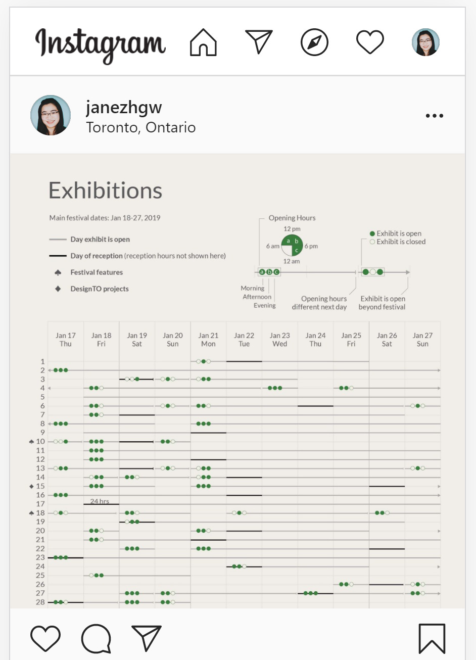
As I worked at Kantar, I continued to develop my personal projects. It was intense at times. I lost a lot of sleep and it was hard to finish my projects. But, I pulled through every time. In 2019, I got lucky and landed a freelance contract. I posted a project on Instagram and someone saw it. It was about a poster I made that showed all the exhibitions happening in a design festival in Toronto. This person became my first ever client.
I had an intense desire to try experimental work outside of PowerPoint reports. So, I decided to leave my job at Kantar and become independent in the summer of 2019. I knew that I wouldn’t get any work right away, so I also freelanced as a social media strategist. Luckily, I had some work through that stream so it helped keep me afloat while I was figuring out what to do with data visualization.
By the end of 2019, I was feeling lost. I didn’t have any direction and wasn’t sure how I could contribute to the dataviz community. I decided to reach out to people for help and wrote an article about it. Someone read that article and recommended me to speak at a conference. It was my first time doing a talk at a European conference about data visualization. I was very scared to do it, mainly because I was the only Asian woman there. I remembered that in recent years, many Chinese women would reach out to me to ask about my career. And I realized they reached out to me because I looked like them. Diversity really does matter. So, I took a deep breath, and did my talk. You can watch a recorded version here.
In 2020, I developed two new streams of dataviz work: Viz the World and Data Documentaries.
Viz the world looks at how we can incorporate data visualization beyond the typical applications of dashboards, reports, and infographics. I implemented dataviz into a food menu to make the ordering process much easier.

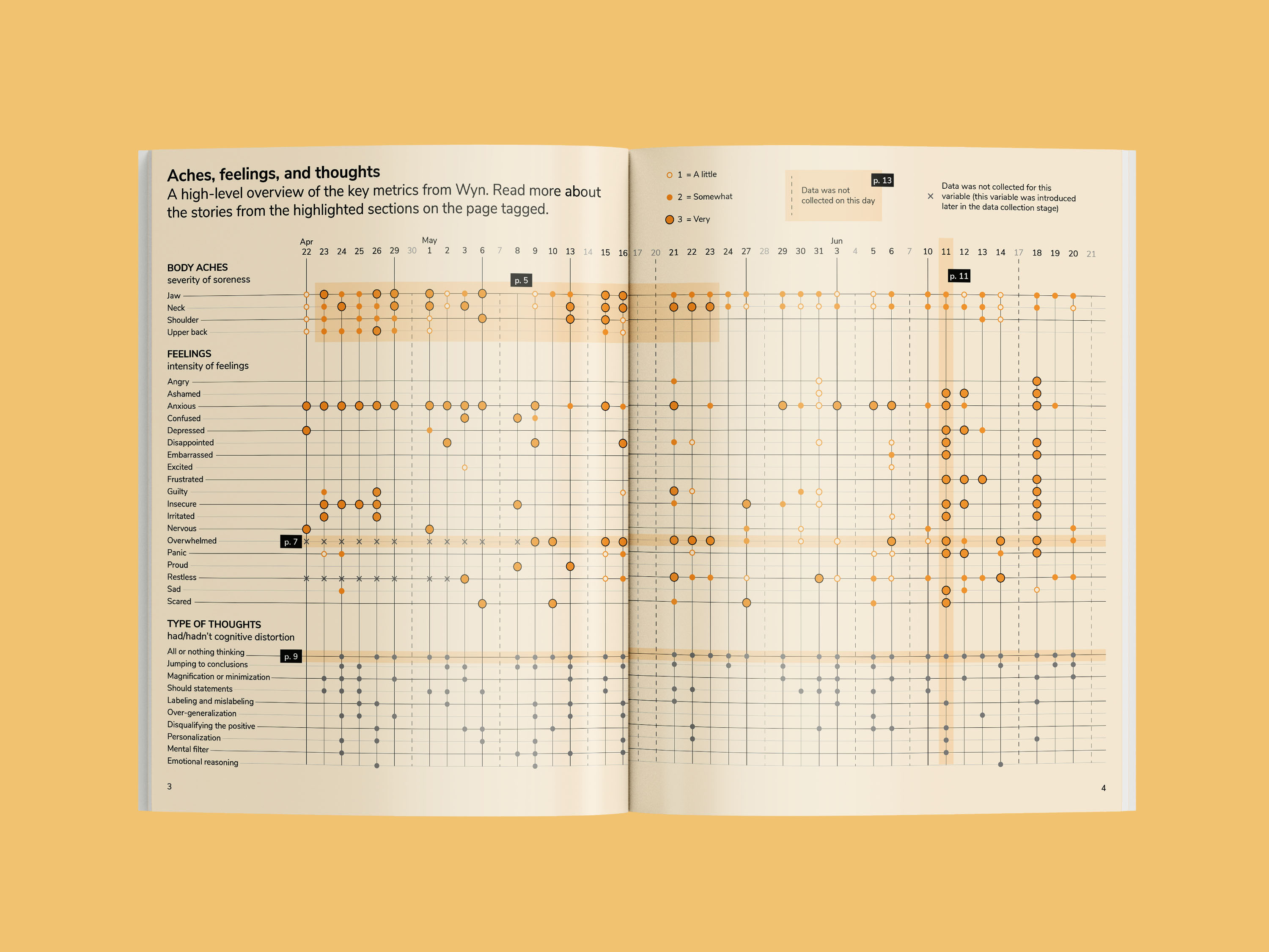
Data Documentaries borrows the concept of a film documentary. Films tell stories over time, frame by frame. Data Documentaries condenses that and tells the story on a page or a spread. I documented my mental and physical health in the span of three months to better manage my well-being.
This newsletter will document my career journey in data visualization. I will share insights and thoughts I have as I continue on this journey. I don’t know how long I will keep this newsletter up, but it’ll be here as long as I am interested in data visualization.
Sign up now so you don’t miss the first issue.
In the meantime, tell your friends!